The gold standard in versatile Switch enclosures gets even better.
I have a big extended family, which means that we travel a lot to visit them. When Nintendo launched the Switch it immediately became my travel gaming device, becoming the default platform for Mario Party and Jackbox and every other social & group gaming that we would partake in — but man, I hated packing up that dock. It meant carrying extra bags and cords and became sort of a logistical nightmare when we were trying to remember to pack it back up on our way out (we’ve forgotten a dock or two on our trips).
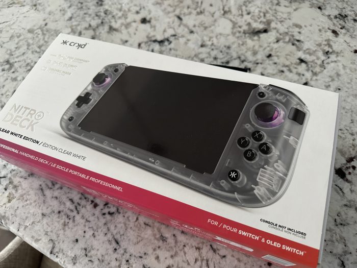
CRKD’s Nitro Deck+ isn’t specifically designed to only fix that dock problem, but the inclusion of a built-in input & output into the device has elevated it to being something that I don’t think I’ll ever be able to travel without again when I bring Nintendo’s Switch with me.
I didn’t own an original Nitro Deck but felt like it was something that could be enticing to own. Some of my Joy Cons were starting to drift and the connections to the Switch had become loose (blame the constant clicking into and out of the Ring Fit enclosures) so stability had started to become a thing. The Nitro Deck seemed to solve for that, while also providing a heftier grip and additional buttons for customization. So, I had expectations for the product’s sequel when it was announced.
Happily, the Nitro Deck+ tops any expectations I had, as well as surprises me in a few novel ways, too.
Comfort
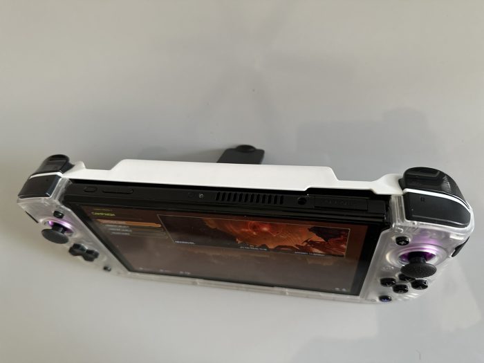
One of the major selling points for the device is its size. With the console docked inside of it, it’s somewhere between the size of a Switch and Valve’s Steam Deck. It’s comfortably weighted, robust so that it doesn’t feel easy to break but not heavy enough where I think I’ll shatter my nose if I drop it on my face while playing Switch in bed at night. I have slightly bigger hands, and the sides provide a curvature and volume that’s just enough surface area against my palms without being an overly thick handle. It feels like a Wii U Gamepad, which leads right into the next important aspect.
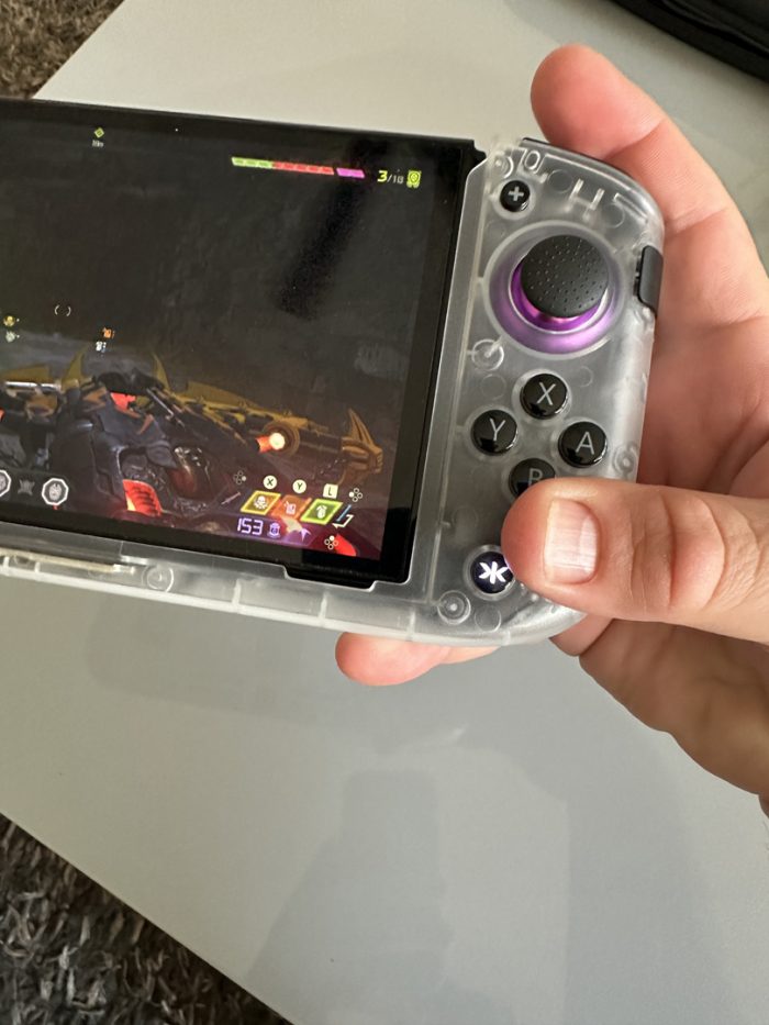
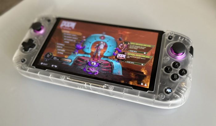
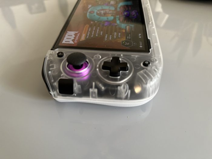
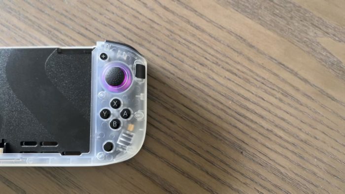
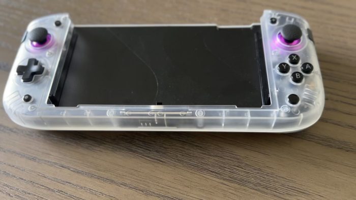
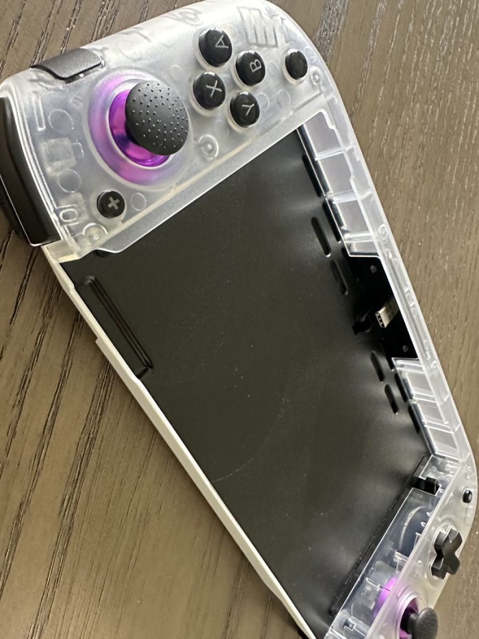
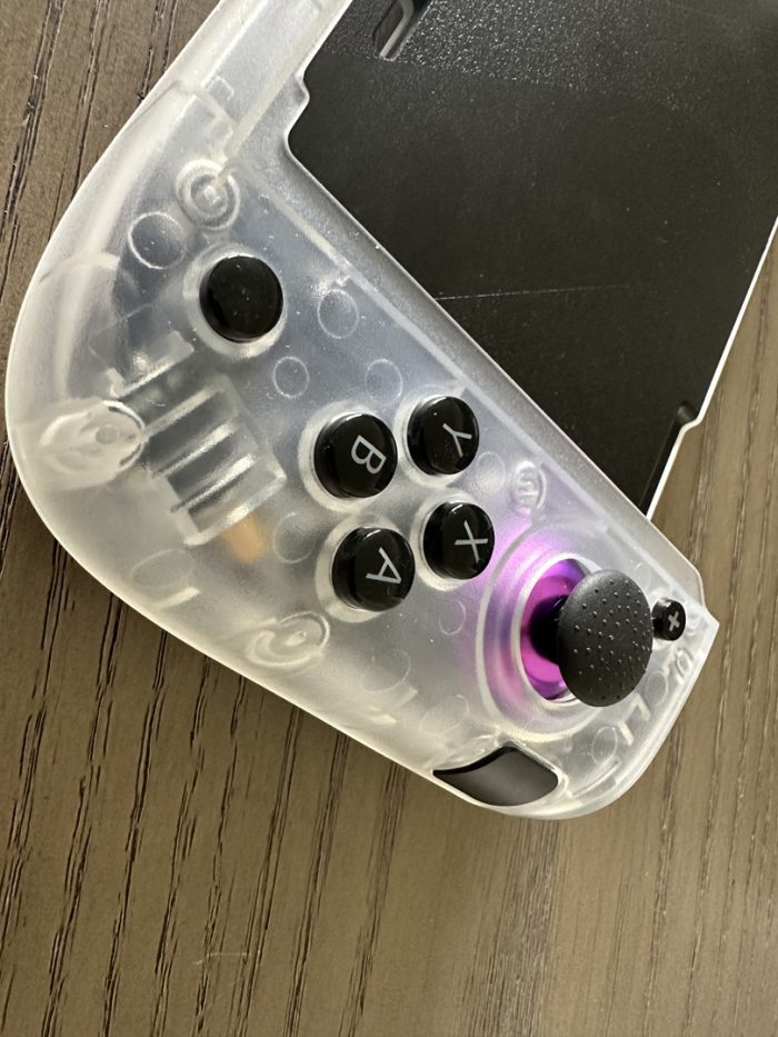
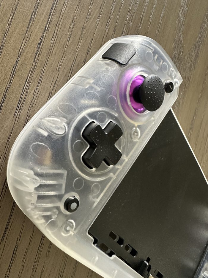
It’s not possible to talk about the comfort without also mentioning the button layout. The original Deck kept the Switch’s asymmetric button layout, but the Deck+ opts to make both sides the same. That is, the sticks are on top and the d-pad and buttons on the bottom, much like the Wii U’s gamepad design as well as other handheld devices. The PlayStation controllers are similarly symmetric, except always having the buttons on top and the sticks at the bottom. The company notes the feedback from the owners of the original Deck as one of the driving factors to make the adjustment. I can understand the ask, but I admit that it took some getting used to. Both the Switch and the Steam Deck use asymmetric layouts, so I’ve been conditioned to those for the last 7 years. It’s fine in a lot of games, perhaps the majority, but I felt like the right stick was ever so slightly too far apart from the buttons for me to quick reach them when I was engaged in FPS gaming and needed to switch from camera to action quickly. I mentioned my hands being a little bigger, but that’s all in my palms; I actually have stubbier thumbs that make it weird trying to hail a cab. Trying to play DOOM Eternal was a bit of a difficulty at first, but after some practice and overcoming muscle memory I actually managed to surpass the level that I had been stuck on for, like, 2 months. So yeah, maybe they’re actually on to something with this symmetric layout, but I think it’ll be up to the user to determine how comfortable they are with making that change.
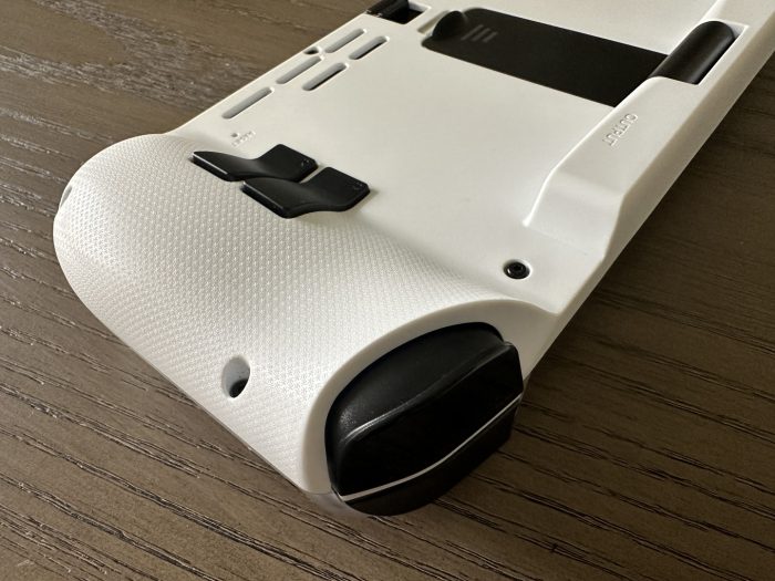
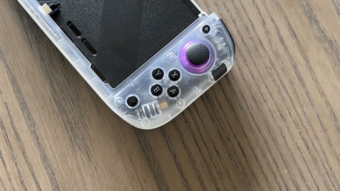
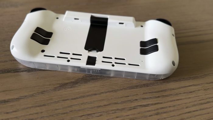
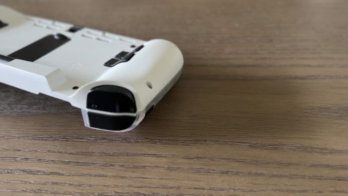
Thankfully the four rear buttons and the two “sidekick” buttons help immensely when making things more accessible to us, as we can refine the layouts for quicker access to the functions we like the most. I will note, though, that depending on how tightly I was holding the Deck I would sometimes inadvertently push one of the sidekick buttons and launch a missile or jump too early. This is due to the buttons being level to the housing instead of being subflush, and their relative proximity to the sticks. The new analog sticks have good ridges and textures on them to give our thumbs a better grip and provide more precise movement, but everything else is glossing and smooth, which comes off as a tad bit less refined. In the design world we like to add textures to everything, as gloss tends to make details feel like prototypes that have just come out of a plastic tool. Something here, even a lite sandblast or some ridges, would have gone a long way in helping our fingers find their spots.
Connectivity
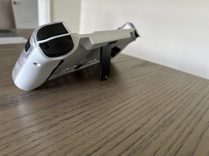
The Deck+ allows a Switch to slide in easily, with direct connection via USB-C, and has a snug fit, locking in well. When I say that it’s locked, I mean that it’s LOCKED in there. The only way to really get a Switch out is to use the lock release on the bottom of the back, which pushes the console up a bit to let us pull it out. The device also has Bluetooth, which connects to a companion app (I used it on my iPhone). This app not only “registers” our Nitro Deck to their system and our account, but also lets us update its firmware and customize everything.
That customization angle is *chef’s kiss* wonderful. Not only can we fix which buttons do what, but we can also adjust how firm of a push it takes to activate them and add in functions like turbo. We can even select levels of rumble. This is important because since the device has some hollow to it, it can shake VERY LOUDLY even on the mid-level. Being able to drop that down a notch (or bump it up if we want to wake the dead) is helpful. All of this is done easily within the well-designed app, although I wasn’t of fan of how we have to connect the two. I was only able to get the Deck and the app to find each other by going to the Switch’s Home Screen and holding a d-pad direction for a few seconds, which sent my icons flying. With all of the buttons on the device, perhaps it would have been easier if one of the others, like a sidekick or rear, was the default.
Aesthetics
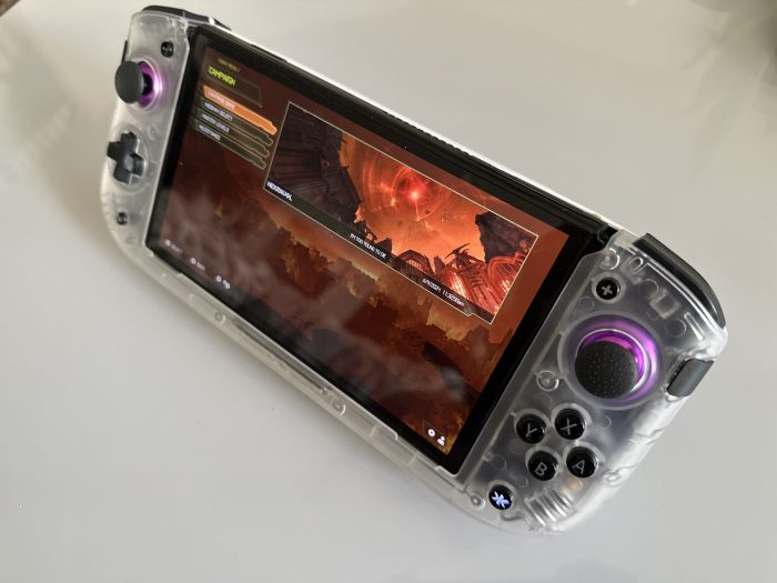
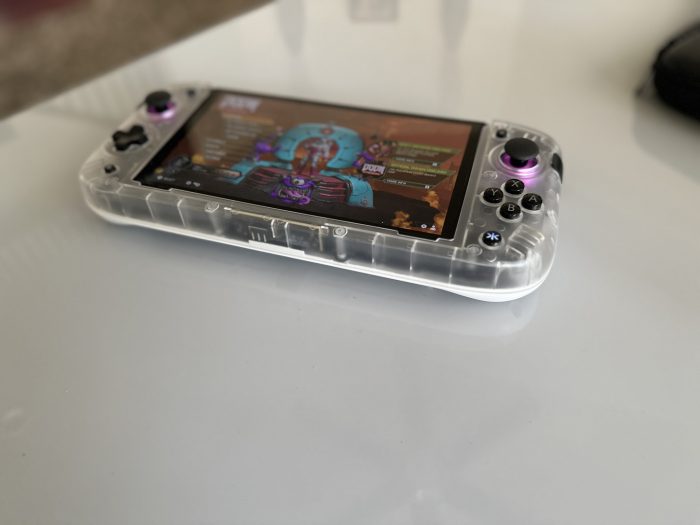
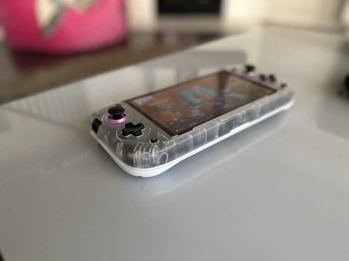
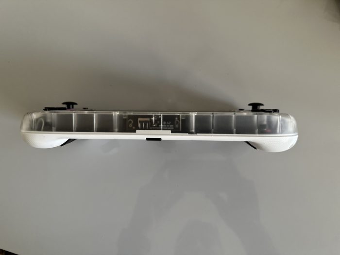
This is a sharp looking device. The unit sent to us has a translucent front with white back, and immediately draws some eyes from folks who know what a Switch or Steam Deck looks like and are curious about what I have in my hands. The translucency gives us a peak into the inner workings of the product, and gives us the sense that we’re allowed to see the complex technology that goes into making this work, something I always loved about Nintendo and Apple products in the 90s. The metallic purple accents around the sticks are also nice details.
Functions
I’ve noted a lot about the analog sticks already, but it’s important to remind users that these are magnetic Hall effect sticks. In other words, these sticks ain’t gonna drift. Holy heck, does this go a long way in gaming, and I can’t find myself willingly purchasing a controller without this aspect. They smoothly glide, like other sticks do, but these won’t go off-target. Like, ever. It’s weird to think that this is something so many companies struggle with (Nintendo and Sony included) but we’ll never have that problem here. We can also pop the caps off of the sticks and add new ones, in case of the typical grime that may accumulate over time.
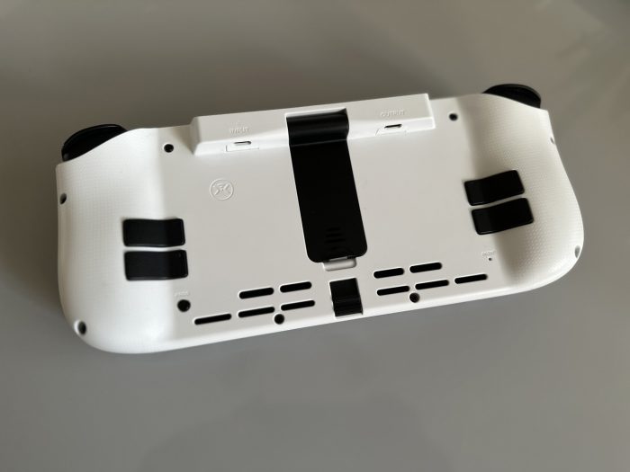
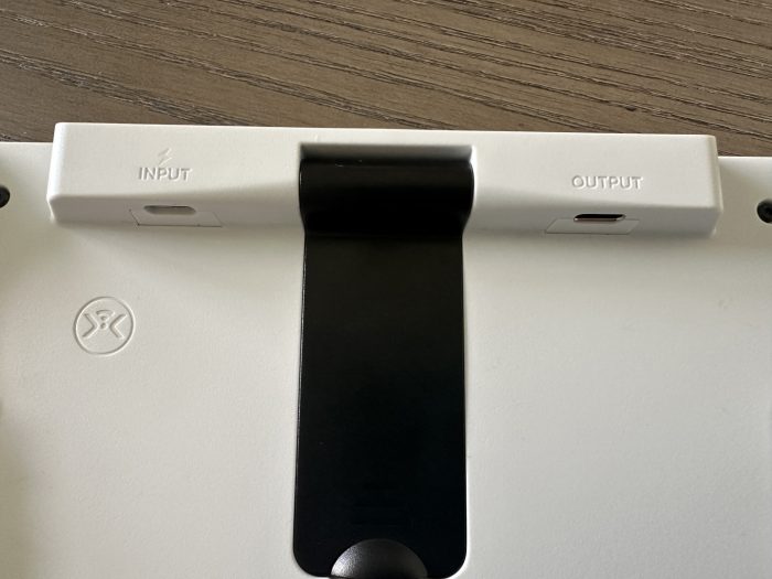
Finally, and maybe most important to me SPECIFICALLY, it’s worth noting that I absolutely loved the ability to plug this bad boy into a TV directly and use it as a docked Switch. That capability is built into the Deck+ natively, and back now has both an input (for power) and output. Just any simple USB-C-to-HDMI adapter will suffice for the latter, and voila — we have our Switch running on our TV screen. I take our Switch all over the place when we travel or for holidays and family events, but abhor packing yet another piece of equipment. This extends to within our home, where I have my OLED Switch dock in our loft but once in a while we like to throw Mario Party on our main family room set. That means that I have to unplug everything from one room and bring it to another, or buy a separate dock and leave it attached to the TV like a lonely, empty soul when not in use. Now I can just take the Deck+ and switch(!) over the cords from my already plugged in Apple TV and I’m all set.
In fact as I write this I’m actually on vacation in Italy, with the Switch hooked up to the hotel’s TV and my daughter playing Splatoon 3 on their VERY BAD WIFI, and I didn’t need to worry about bringing anything else that would take up space.
The CRKD Nitro Deck+ is a terrific device that discerning Switch owners may want to invest in. It’s an important device too, I think, because not only does it solve a few of problems we’ve had with the OG Switch, but it shows some incredible opportunities for using the platform in some fun new ways. If anything, it’s extended the life of this little device, making Nintendo’s 7-year old platform feel fresh and new again.
This review is based on a hardware unit sent to SideQuesting by the manufacturer & PR.






No Comments