The popular client’s update is a long time coming
I have absolutely railed against Steam’s VERY OLD AND NOT USER FRIENDLY GUI for some time now, and essentially gave up thinking that the company would address it. Well, guess what? THEY ADDRESSED IT.
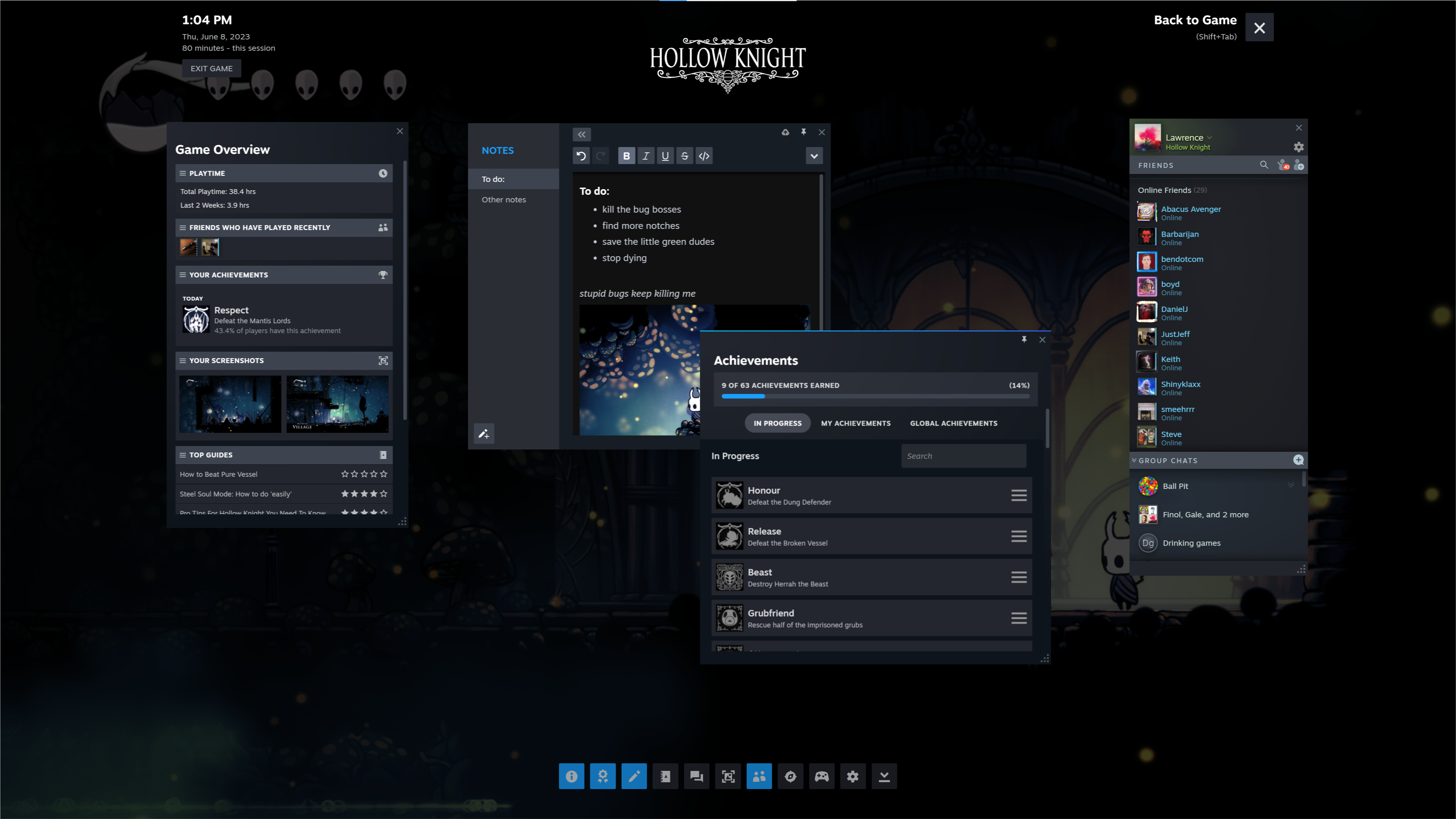
With a video dropped during Not-E3 week (of all times to do it!) Valve has announced a pretty big overhaul of the Steam desktop client. The biggest may be on the backend, as code is now much more easily shared across desktop, Steam Deck, and Big Picture Mode for a much more unified experience. This essentially means that the different access points for Steam will now be able to share features and updates much more quickly, and more in line with each other.

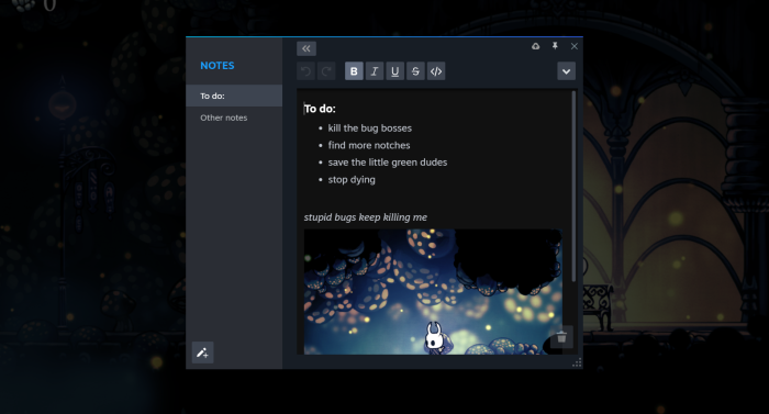
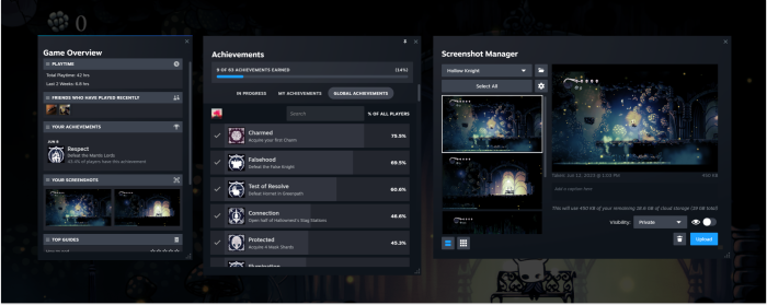
Speaking of features, one of theme is Notes, a method for users to keep track of info and have it live in and be accessible from the cloud. Write on Steam Deck, and it appears in the desktop client, for instance. Notes is a big part of the all new in-game overlay, which will make accessing features, saves, and online content that much easier. In fact, it’s much closer to how modern consoles do it, putting Steam more in line with the changing accessibility and ease-of-use trends of what players demand.
Speed, basically.

Visually the client isn’t getting a massive overhaul just yet, but the quality of life improvements can be seen scattered throughout. It’s easier to manage downloads and updates, for instance, and hopping into settings and screenshots.
Baby steps, but much needed. The client update is now live.
All of the info is here (via Valve): Steam Client Update


No Comments