Spelunking is bad for your health
I am an absolute sucker for 70s & 80s adventure and text adventure games — the Sierra On-Line, Infocom and Lucasarts releases were my go-to experiences on PC for well over a decade, and ZORK and King’s Quest were regularly on repeat. When I heard that that Sierra’s legendary Ken and Roberta Williams were coming out of retirement to take their know-ho towards bringing one of the earliest text adventure games, Will Crowther and Don Woods’ Colossal Cave, to the modern era, I salivated at the opportunity to relive my youth all over again. It was happening! The Avengers of Interactive Fiction! Yes!
Except, well, no.
This new version of Colossal Cave sets out to do a lot of things with the IP, with only a passing grade on some and a failure in some big ways on others.
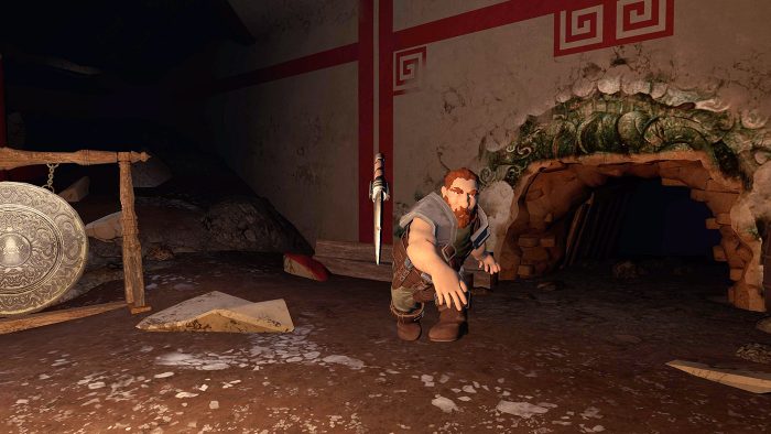
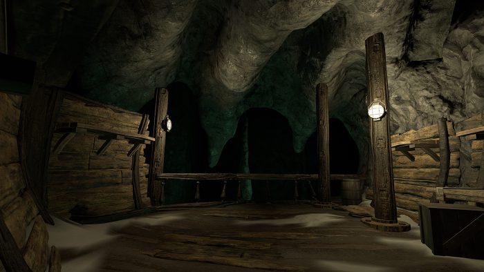
Technically, the game is all over the place. The Switch version I reviewed is slow (although I’ve found similar issues with the game on PC as well). The visuals look rudimentary at best; they’re often blocky, they lack detail, they feel static and dead, the lighting is off, and the character designs are dead and devoid of any draw. The snake? Hilariously bad. The Dragon? I walked up to it and it didn’t breathe fire on me, it just stared and walked back and forth. And the pirate? Well, he looks like he’s wearing the cheaper costume I bought from Party City because the expensive one was out of my budget. The huge difference in designs makes the game feel like a collection of assets instead of having any cohesion.

The game is also clearly designed to be played in VR, as the text within the game’s menu on the Switch references the VR aspect exclusively, and the dual stick controls feel as though we’re piloting a tank. The animations are stodgy, too, which makes things even more glum. The game’s not supposed to be glum, it’s supposed to be frightening! Thick with tension!
And that’s perhaps where Colossal Cave fails most.
The reason that text adventure games work so well as a genre is that it forces us to do two things: imagine, and be creative with our imagination. *NOT* seeing our surroundings activates a subconscious level of wonder. Because we can’t physically see the room we’re in, we need to ask and look and spend time in it and think about it and try everything — everything! — before we finally find a solution. And if we don’t find a solution, we remember and come back later, hopefully with some tool or key we found in another space. It’s almost visceral. And it keeps us coming back to play again and again, because what if we didn’t ask the right question? What if we could have tried a different item in a different spot?

Seeing this with actual visuals stops that feeling at the (cabin) door, and it drains us of that creativity. Instead, we just start clicking on everything, until something works. And… that’s it. Just click. If it doesn’t work right away, click around in the next area, and then click around some more in the next. And then the game is eventually over.
It makes the puzzles feel all too easy, and makes us feel like we’re way too smart for the game.
Which is unfortunate. I felt like Einstein when I first used the [insert item] with the [insert puzzle] as a 10 year old back in the 80s. And I still feel like that now whenever I play a game someone makes through Twine. But when I see those puzzles? Well, it just takes all of that wonder away. I’m no longer figuring things out; I’m just clicking things until they work.
This review is based on a Switch code sent to SideQuesting by the publisher. It originally appeared on the February 8th, 2023 episode of The SideQuest. Images and video courtesy Cygnus Entertainment.
There’s a tip line available for the game at 206-207-9017, which is a neat idea for nostalgia. The reviewer did not use it.


No Comments