True to the name.
I have a wall in my office filled with sticky notes. Some are marked “idea!” and I’m convinced that they’ll make me a million dollars, while others are to-do lists and shopping lists and telephone doodles. All notes are cool, but because they’re all on that same wall the grocery lists and sketches of shoes drown out the awesome ideas. I have to dart my eyes around the board to find those ideas, but I usually get tired or distracted by the shoes. By the time I actually get around to the idea, it’s time has passed and I may as well start a new one.
That’s Hindsight 20/20.
There’s a neat kernel of an idea, but it’s completely lost in a forgettable game, the result of what feels like a grab bag of assets that never homogenize into one firm direction. The sales pitch is bold: a team of industry veterans have come together for a project that focuses on moral decisions and how those decisions affect not only narrative but the gameplay itself. Promising several different outcomes, character paths, and ways to tackle battles, each playthough of the game might really stretch the choices of the players, teasing them with the desire to come back again on another run and see what could be different.
But that’s a promise, and execution feels different, mostly because of everything around that premise of morality.

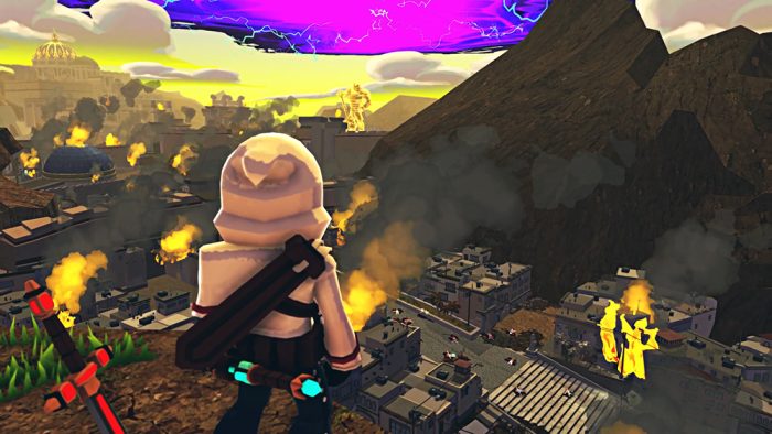
The plot has some definite seriousness to it. Characters are affected by a strange plague, causing interpersonal issues and the possible collapse of the Kingdom. As the hero Jehan returns to set right the many wrongs he and his family have committed, the Raakshasa (the name given to those afflicted) begin to attack the city, tearing apart its very way of life. The game’s mission-based structure lets Jehan focus on one small story at a time, such as dealing with an afflicted wife or finding missing children. It’s dark, and often VERY dark, but is designed to add some weight to the severity of the situation as players head into the quests’ associated dungeons.
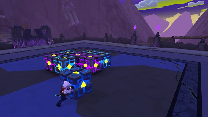
The dungeons themselves don’t feel like much more than a series of interconnected rooms, where the majority of the obstacles rely on running to one end of an area, flipping a colored switch, then running all the way back to a matching door and flipping another. This needlessly expands the length of the experience, and feels tedious after the first time, especially in rooms that look just like every other. The bouncing around rooms is broken up by battles, where the morality tie-in seems to come into play.

Players can choose if they want to kill (the Ruthless route) or just stun (Merciful route) enemies, knowing that killing means more negative results (but easier battles) and stunning means that they can reap some slight praise from the NPC townsfolk. The latter seems like the true narrative choice, but it only really ever makes the already grindy battles even more cumbersome. The fights take place in monster closets; that is, they only happen in specific rooms with specific waves of enemies that spawn one-by-one. Once the battle morale is chosen, the enemies will either attack immediately or begin the fight with a repeated line about “respecting our town’s values.” That comes off very awkward, knowing that they’re trying to kill you anyways. The encounters feel mostly the same each time, and the boss battles aren’t much different apart from waiting and watching for a specific pattern. Attacks are combo-based with canned animations, and don’t always leave us feeling like we have actual control of where or who we are attacking. Video game battles should be fun, but these unfortunately come off like chores.
The game links all of these battles and choices together to switch up the experience each playthrough, leading to NPCs reacting differently, boss battle changes, and even changes to the town, but they’re outweighed by a truly strange choice in visual aesthetic. Now, in a more traditional or light-hearted action adventure, a cel-shaded style is generally par for the course, but the heavy material here makes for a jarring difference in tone. We’re supposed to care about our choices, but when the dilemma is explained to us by a muppet-like human NPC it’s difficult to keep a straight face. The correlation between the two is broken.

To top it off, the choices the team made towards their user GUI is fragmentary. Fonts change type styles, sizes, and locations on the screen almost obligatorily. Hopping from the HUD to a conversation in the overworld to a more direct convo with a major character moves the text boxes all over the place, and the in-battle HUD at the top of the corners has tiny text and bars that are difficult to differentiate from each other as they’re not labeled. But this is all by design! These were conscious decisions that the development team made. They even manage to overshadow a nice soundtrack that pops extra well through headphones or good speakers.
It all feels like a missed opportunity, a collection of ideas and parts that never gel and work against each other rather than with.
And I feel like all of these inconsistencies and issues could have been avoided. They’re just “what ifs,” things that could have been caught or adapted or prepared for, but they weren’t. There are novel ideas that I want to see explored and grown upon, but they’re not executed well here. Maybe they could have been if more passes were made in front of more team members or the game was run through a proper Early Access program. But then it’s easy to look back. It’s easy to point out these issues. Maybe we should have been ready by looking at the game’s name itself, an almost harbinger of what was to come: in this case, Hindsight really is 20/20.
This review is based on an eShop code for the game sent to us by the publisher. It’s available across Xbox, PlayStation, Steam, and Nintendo Switch.


No Comments