Does it make Sense?

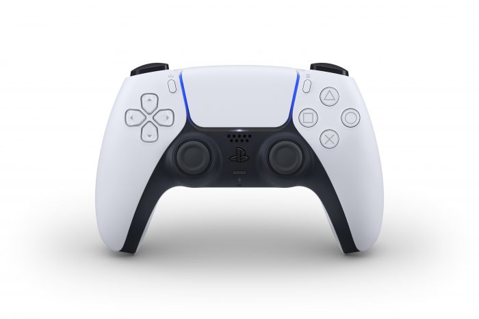
Well, there it is: Sony’s new game controller. The PlayStation 5’s controller is named the “DualSense” and features a host of new features not found in the DualShock 4.
Haptic feedback will give new vibration and reactions to touch and button presses. Adaptive triggers are now added to the L2 & R2 buttons, so that depending on the situation the button tension will match. Sony mentioned the feel of a button getting more tense as a bow string is pulled back, but we can already imagine the braking variability of different cars and tires on distinct road surfaces in Gran Turismo.

The Share button is gone, replaced by a new Create button — Sony hasn’t detailed what the additional functionality of this button is, but it’ll likely go beyond just snapping a photo or streaming to Twitch. A new microphone array is added to the controller for those that want to chat with friends *and* annoy their nearby family members in the process.
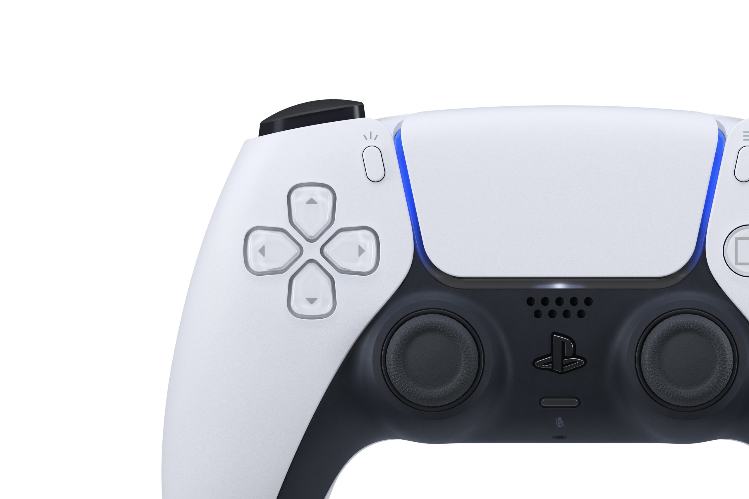
The biggest news, however, might be the completely new look. It’s far from an evolution of the PS4’s controller; the DualSense is a rebuild of the product, focusing on making it feel smaller and lighter than it actually is. And, it’s likely at least as large as its predecessor.

That’s where the two-tone comes in. Gone are the single-color days of previous generations (until later, when Sony eventually sells an all-white or all-black version for cost-cutting needs). The lighter upper is meant to draw your attention away from the new thicc waist of the pad. The face buttons and layout are nearly identical to the DS4, but now are shiny and clear. The touch pad is still there, but now it’s wider and framed by the lightbar, which has been moved to the top.
The controller could very well be a harbinger of the upcoming PlayStation 5. With the tectonic plate look of the device, we can only imagine that the PS5 will have similarly smooth(er) forms than the PS4 gen.
Source: PlayStation Blog


No Comments