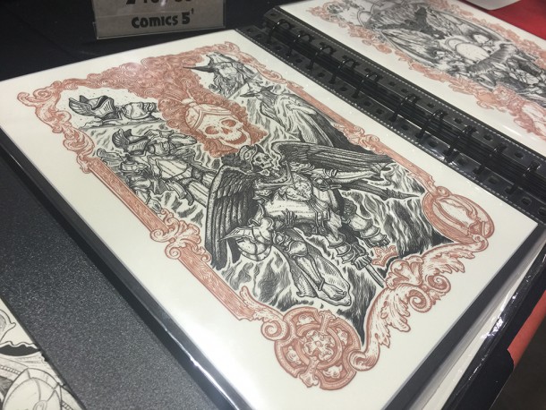
Artist Alley isn’t a new invention. At many media and comic conventions, sections of the halls are devoted to lines of booths for individual artists and tiny publishers. No, it’s usually not where you’d find Marvel or DC, but many of their creative forces will make their homes there. It’s also my favorite place to be at cons, as I’m able to get up close with artists I admire, and often discover huge inspiration with the art styles that abound.
The best places to look for inspiration may be with the independent artists — those not necessarily tied to a major publishing house or property.
Two years ago I had the fortune of meeting JM Dragunas at Detroit Fanfare, showcasing his unique black & white ink art style. Since that time his style has grown to include splashes of color, more contrast and a greater variety of subject matter, and at Motor City Comic Con I had the chance to catch up and see just how.
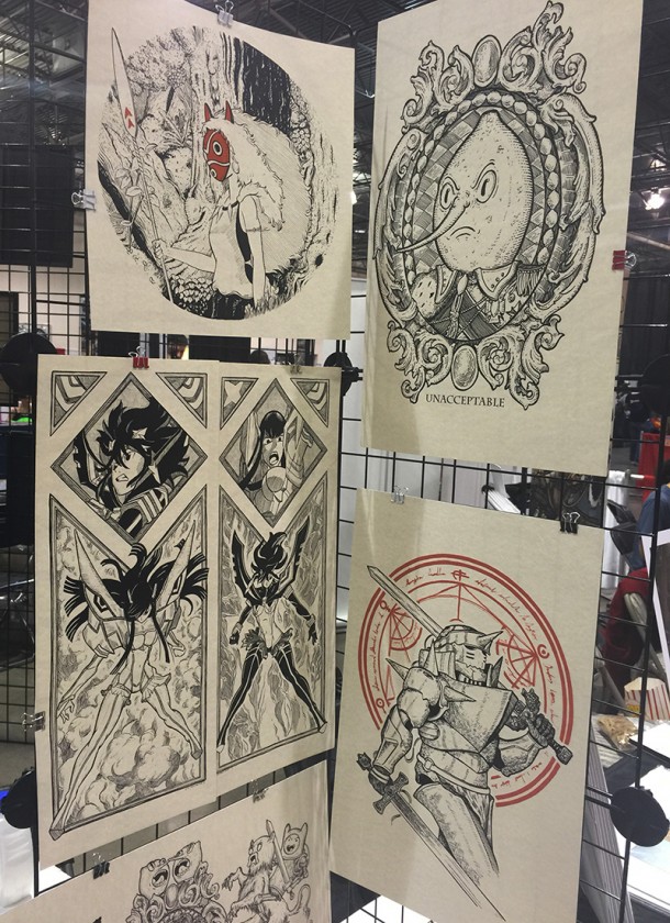
It’s something he had been experimenting with, he explained to me. Black and white felt like second nature, but going full color would have required a very different approach to the work. Just the addition of red linework required much thought, but pushing to include it made for a deeper level of contrast that he didn’t have before. The result is striking pieces of art, with plenty of white space and contrast, and terrific to hang on walls.
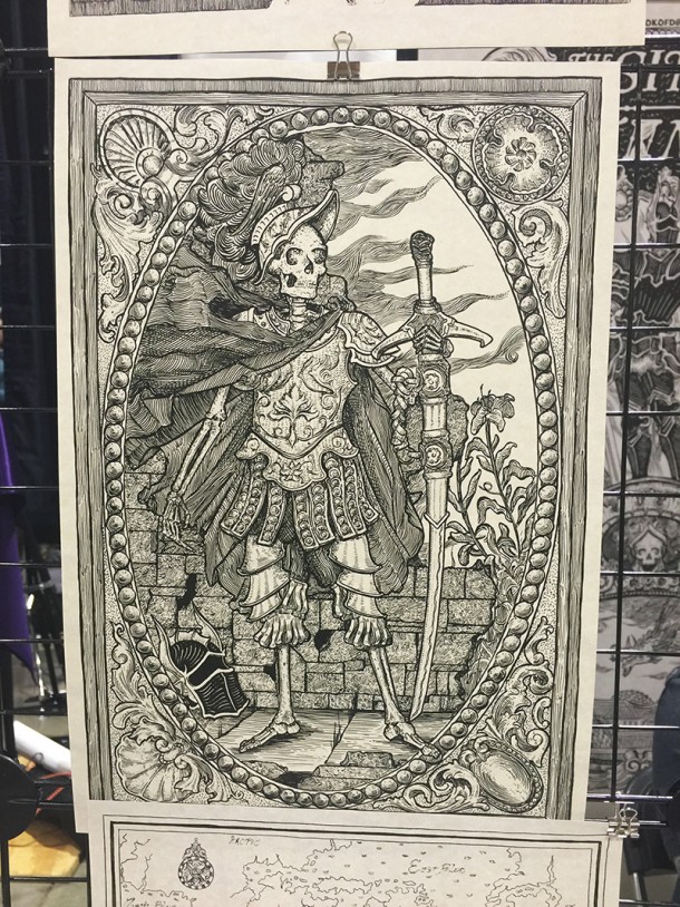
What most intrigues me of his work isn’t necessarily the addition of color, but the shift to more of an engraved, woodcut print aesthetic. His work centers on fine lines, often thousands of tiny and precise strokes in a square inch, to create three-dimensional depth. Even after the initial pencil-work is done and many of the strokes laid out, the slightest error in inking (Dragunas often uses a crow’s quill) can result in huge reworks.
It’s craftsmanship, to an nth level.
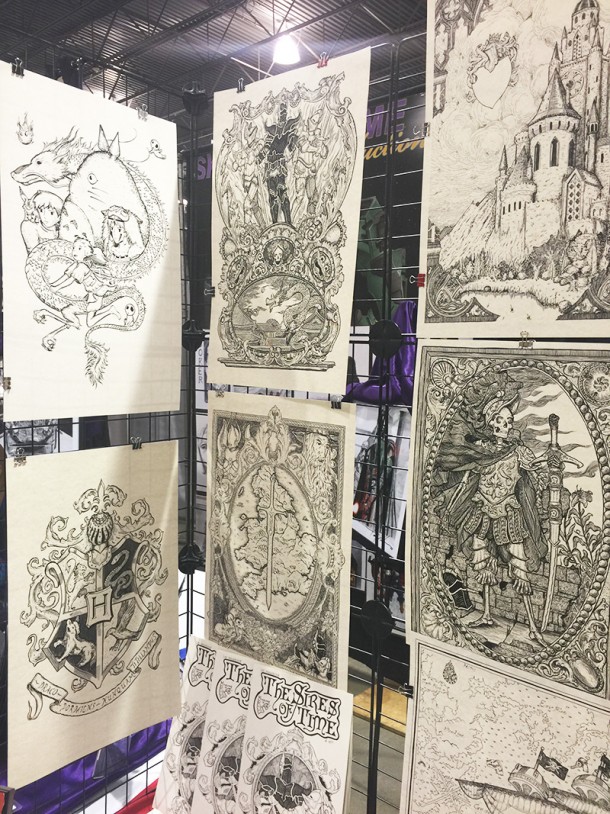
Perhaps that’s why I’m excited about his first book. The Sires of Time is focused on Arthurian era knights that travel through time, thwarting magic and displaying heroism. Whether the plot is to your tastes or now isn’t what will draw you to it, it’s how the many aspects of his style and influences come together.
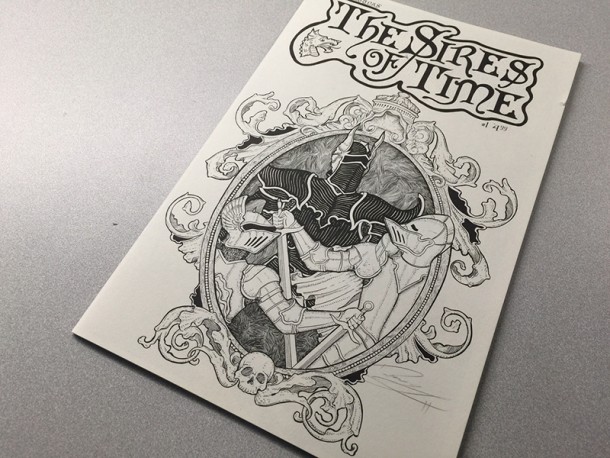
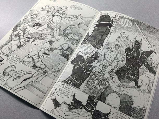
Printed on parchment paper, the pages are heavy and thick, like Middle Age scrolls containing incantations or legendary stories. The artwork often spans two pages, showcasing castles and vistas, battles or character introductions. There were essences of Tolkein sprinkled in, for a familiar taste. “I love to just sit and draw,” Dragunas tells me. “I love that the details, even when they’re intensive, become a sort of extension of my hand and quill.”
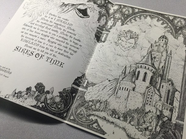
It’s a short read, but one worth browsing through just for the imagery and page layout alone. Dragunas says that it’s the first book in hopefully a maintainable style, as he wants to tell the heroic stories of the four knights as if they were handed down through generations.
It’s not something you can find in mainstream books. It can often feel personal, and even though the term “labor of love” is thrown around when Indies are involved, it seems to fit Dragunas’ work well. Stories of knights may be memorable, but when a style like Dragunas’ arrives it can become ingrained in our brains far more than words.
JM Dragunas can be found at DragunasMonster.com, and on Instagram and Twitter at @JMDragunas
All artwork in photographs is copyright and owned by JM Dragunas. Photographs by Dali Dimovski for SideQuesting.


No Comments