I’ve been huge into independent comics over the last few years. I’ve grown extremely bored with Marvel & DC, focusing more on books like Saga and Walking Dead and Sex Criminals. Cape and cowl books haven’t been cutting it. The stories have been predictable, and the art fails to live up to the exceptional covers — just take a look at any of the X-Men books for evidence of that. Really cool covers, not so great engagement inside.
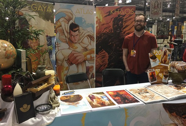
I bumped into creator Dave Swartz at Motor City Comic Con’s Artist Alley last week while looking for more indie books that could surprise me. Though my eyes darted around a booth that included fresh plants, globes, incense candles and leather journals, I came to a full, record-scratching stop when I saw the art on the wall behind him. It looked clean and energetic, popping off the paper. The mix of colors had an almost zen-like quality, focusing on complimentary turns and an almost pastel-like depth.
It felt like something you would stare at while waiting for a college psychology course to begin… in a mountain spa.

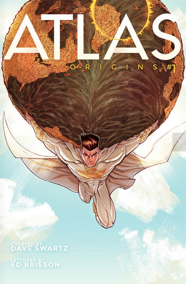
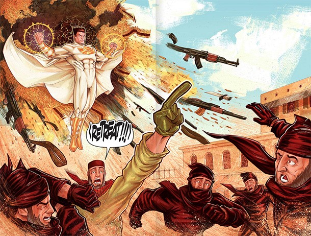
“Why can’t the inside of a comic look as cool as the outside?” Swartz tells me as I flip through the pages of the first issue of his comic book Atlas: Origins. The pages are elaborate, often spanning both left and right to give an explosive or action-packed image the amount of space it needs to breathe on the paper. There is a lot of detail in the art, with each panel sometimes taking days just to pencil. Swartz is moving at his own pace, focusing on making each page within the book look as extravagant as the cover.
It’s a considerable undertaking, especially for what is essentially a one-person team; apart from Ed Brisson handling lettering, Swartz is writing, penciling and creating the book almost all by himself. Thanks to modern technology, it’s not necessarily as difficult as it may seem; however, it’s still painstakingly time consuming. The art is created digitally, allowing him to use a water color style that takes time to build up but ends with fascinating results.

The book’s plot — a man loses his family in a massive attack on New York, only to find himself embroiled in a resurgence of Gods and mysticism that ultimately transforms him into a super hero — dives into belief as much as it does battles. The art style is tied to the themes of the book. Facing a creative impasse on the project which he had abandoned for years, Swartz turned to ancient cultures, religious history, UFO theory and even Buddhism to rekindle his passion for the book. These subjects carry unique visual queues, and bolstered by the psychology behind them Swartz incorporated many into the book, tying the entire package together.
To Swartz they’re more than therapeutic, allowing him to revisit a project he had to shelve years earlier. To us, the great art may be enough to draw us in to the book, potentially hooking us before we even let the words sink in.
Atlas: Origins #1 is available to read for free on the book’s website, with orders for printed & signed copies available as well.


No Comments