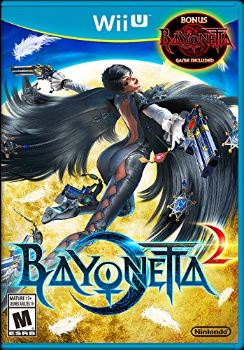
I noticed something while perusing through Amazon, scouring for updated release dates and unannounced games. I’ve been a fan of Nintendo box art design for the Wii U, praising their compositions and ability to load up an image with color, contrast, and depth. There was always something refreshing and likable about it.
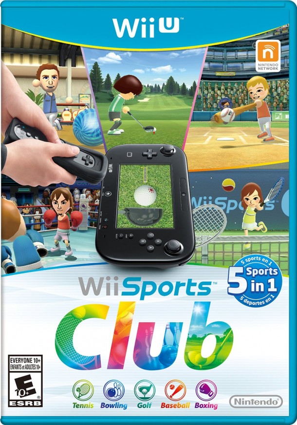
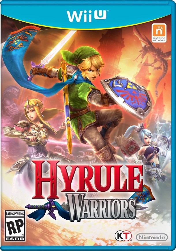
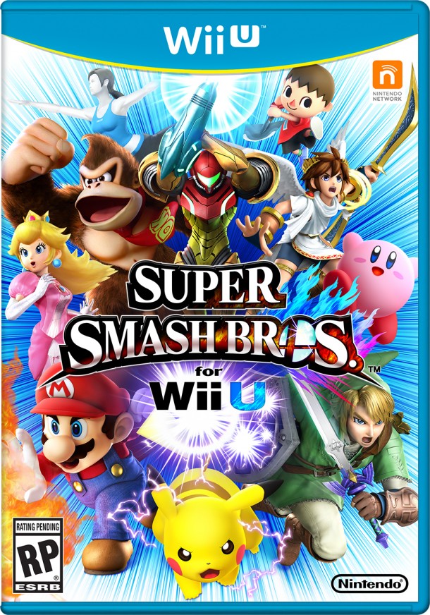
But, seeing the slate of their upcoming games made me catch an aspect of their box art designs that I hadn’t quite noticed before: their shifting of the title blocks to the bottom half of the layout.
First, the titles/logos. It’s not uncommon to see a game’s title shifted to the bottom half of a box or advertising. It happens in all manner of media, actually. One of my favorite aspects of the Saga book series is it’s visual design, and the simplicity in its title and font allow for the rest of the cover to breathe.
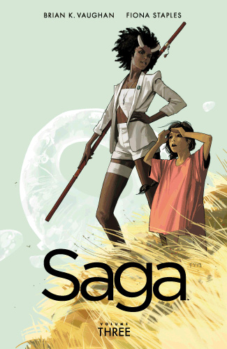
Just look at the cover to volume 3. Gorgeous, right?
Again, it’s not a new design device. However, ALL FOUR of Nintendo’s announced game box arts have the titles/logos in the exact same layout. Let’s take a look.
Bayonetta 2 (which you can see above).
Captain Toad: Treasure Tracker.
We don’t have Smash Bros box art yet, likely because we don’t even know if the name has been finalized yet. [Edit: Yes we do! See below!] But the rest? Well, that’s not coincidence, that’s a conceded effort. Nintendo is designing their first party games to all share a visual vocabulary. When someone views the boxes, their eyes get drawn right away to the title and then move upward, eventually settling on the “Wii U” logo at the top. It’s a subtle way of saying “this game is only on this console”, or “all paths lead to the Wii U”. Tricks of the illustration trade.
This doesn’t quite make the artwork memorable, since the color palettes are similar and the vibrancy is intact throughout all of the games, but at the moment when we’re viewing them on a store shelf we can tell get a specific vibe and feeling of what we’ll expect from the game. The high-quality renders used in the images also indicate a well-polished game. There are no rough edges, scratchy sketches, misty or foggy scenes. There’s complexity, and high levels of it.
Nintendo has been doing this throughout the life of the Wii U, with games like Wonderful 101 and even this year’s Donkey Kong Country: Tropical Freeze. But this soft “relaunch” of the Wii U may be pushing the company to create a visual family of products, at least for this year.
Another discovery, which I noted that the company was doing in the past, is the heavy reliance on the Golden Ratio.
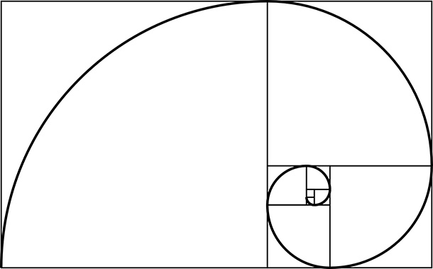
The Golden Ratio is a scientific theory of relationships that often leads to what we would think to be attractive objects, edible fruits, and positive experiences. And probably Deadmau5 music.
I took the liberty of overlaying the Golden Ration onto Nintendo’s upcoming box arts and…
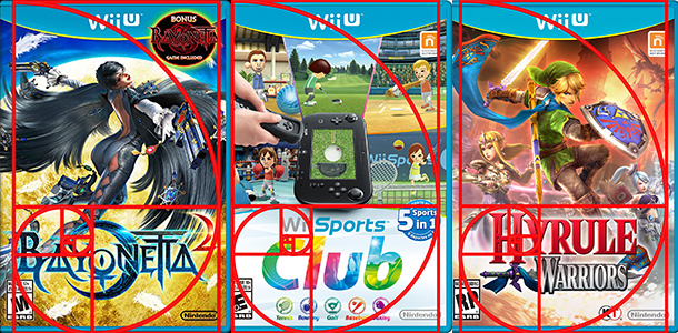
All the same. Captain Toad was close, but the company chose to mimic the block world of the game in its logo, which pushed it more towards the center than along the Golden Ratio.
No matter, we’ve used science to prove that Nintendo likes to make their box art all the same, or at least employ a lot of the same tricks during this crucial Fall season for the Wii U. It may not translate to sales, but it will translate into really really REALLY nice box art.

4 Comments