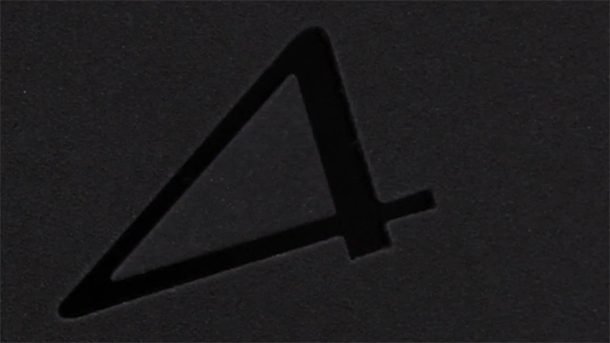
It’s just a blurry box, but it’s enough for Sony to try and steal a little thunder from Microsoft’s big day tomorrow. With this teaser video, seen below, Sony has given us glimpses into the actual industrial design of the Playstation 4 console. While brief, the video shows static images of parts of the console, the DualShock 4 controller, and the new PS4 Eye camera fading in and out dramatically over an extremely blurring square box, one that we think is probably the new PS4 design.
Little is seen of the Playstation 4 in its entirety, but a few things are apparent:
- Matte is back, a la the PS3 Slim designs. And we like it. Goodbye, gloss!
- The new “4” font design is probably the logo, which we also like. It’s heavy on the right-angle triangle and stands alone on the device, not a part of a “PS4” or “Playstation 4” combination. It’s also not matte, as opposed to the surface around it, giving it the darker, glossy black color inside it.
- Lots of stippled textures, metal accents, geometric shapes and angled surfaces
- It feels in line with what the PS3 design has been doing, as opposed to the PS Vita. It mimics what the company is doing in the design of their home theater systems, especially.
- It’s meant to look and feel premium.
For several more images, members of NeoGAF have grabbed stills from the video.
Or, just watch the video right… now.

No Comments