“Tim Burton.”
When the director’s name is uttered, it’s often associated with groundbreaking animated films or reimaginings of cult classics. His work carries the connotations of children’s films “gone bad”.
It’s also highly fitting for Quantum Conundrum.
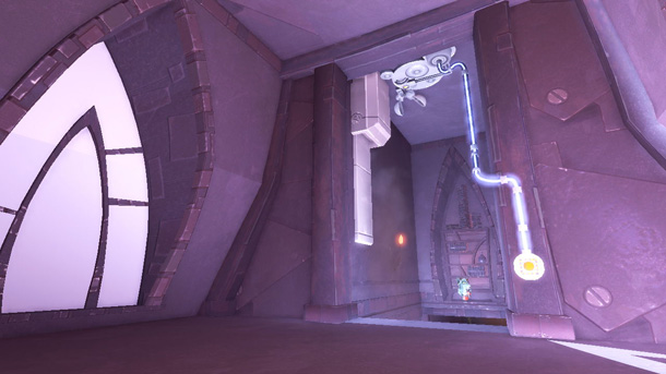
Kim Swift, the Lead Designer on Airtight Games’ upcoming XBLA/PSN release, runs down a list of influences that begat the game’s aesthetic. “Tim Burton, definitely, and classic Disney cartoons. We wanted to make everything feel foreboding.” The proportions of the static objects within the game – statues, windows, and furniture, for example – appear playful yet overpowering. Think Nightmare Before Christmas, with a more modern style but no less haunting or eerie.
The camera angle is also purposefully lower to the ground. “You play a ten year old, so everything needs to look bigger and taller.” Being down low helps that, and helps make the game’s puzzle-solving mechanic more believable.
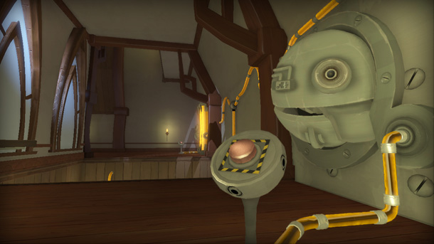
Conundrum throws the player into a multi-dimensional world where physics change and puzzles are solved depending on which phase the room is switched to. Objects react differently depending on their dimensional physical aspects. “Fluffy, Heavy, Slow, and Reverse.” Those sound more like dance moves than puzzle mechanics, but are actually the result of a lot of decision-making. “We brainstormed a lot about the dimensions. I had come up with fluffy and heavy, and the others came out of the team’s effort.”
The dimensions are named to give you an exact idea of what they result in. Change a room from it’s normal state to fluffy makes all objects within it lighter in weight. Heavy turns them into iron. A hefty safe in one phase becomes as light as a pillow in another, and a book can shatter inches-thick glass when transformed into an iron brick. The slow and reverse dimensions deal with the movement of objects. “We designed the dimensions first, and used them as tools to create the puzzles,” Swift tells SideQuesting. Playing as a ten-year-old boy allowed for the strategic weigh of the objects to resolve the puzzles. An adult could probably nudge a safe, if not try and drag it across the ground. A child, on the other hand, doesn’t have the physical capability. “Every object has a weight to it, a specific size and purpose. We wanted to make sure that when a child picked up a box, it wasn’t too heavy or too big for him.”

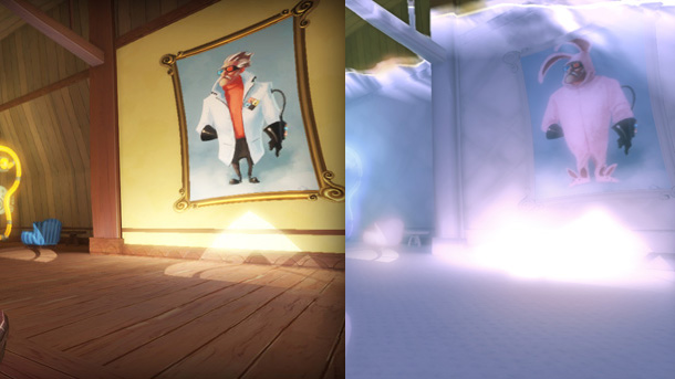
Beyond the physical attributes, the visual aspects of a room change to reflect the different phases. When in fluffy, the objects, textures, floors and ceilings all have the look of pillows and clouds. In heavy mode, everything gains a rusty iron overlay. The changes affect every aspect of a room. Stitches turn into rivets, wood becomes marshmallows, and a crate becomes an iron safe. The visual touches are like little Easter eggs scattered throughout the game. Paintings on the walls change appearance as well. A hunter on a safari dons fire baron garb in another dimension. “We thought about what we could visually change, and the paintings were a natural fit. Our artists did a great job injecting little details to really change their meanings.” Even though the game is narrated (extremely well) by John de Lancie, the paintings are there to give little insights into the background of the characters and input into the story… or are they? “Well, we can’t really say. That’s for you to find out. You may just want to pay attention to them, though.”
The puzzles are designed to be solved a specific way, but like other physics-based games the player can use the tools to his or her advantage to solve a puzzle — and often by accident. “One of our designers found out that by switching between the fluffy and heavy dimensions he was able to make a sine wave as he pushed a crate across a room. He called us over to take a look, and we all got really excited! Here was this whole new way to resolve puzzles. We began brainstorming right away after that on even more ideas.”

Though the designer who discovered the trick isn’t ten years old, it’s exactly that kind of exploration and problem-solving that kids can do so well, and fits the game perfectly. Combined with Swift’s experience in the genre, the polish that the team is infusing in their puzzles shows off in the demo that we played. The puzzles begin seemingly simple, but quickly evolve to become more challenging as rooms are completed. Just three rooms in we were challenged with shifting between fluffy and heavy to move a crate across a room, building ramps and avoiding lasers along the way. “It has to be just as fun to fail as it is to solve the puzzles. We don’t want players feeling like they are losing, we want them to feel like everything they do is helping them learn and get better.” The game’s devices allow for trial and error, so that puzzles can be retried as often as possible and multiple check points allow for a quick respawn if you should happen to fall off of a ledge… several times.
Like any designer Swift is interested to know how her game will be received, but you’d be hard-pressed to see it. She’s much more excited to watch others play in her world. “I think the best part of developing the game has been the hands-on previews. Everyone solves a puzzle differently, plays the game differently. But everyone also smiles when they finally get it. That’s the best part, that smile at the end.”
With the combination of aspects of Hollywood animation, deviousness, and happy accidents, the only puzzle left is finding out how not to smile when Quantum Conundrum releases later this year.


No Comments