The year 2011 wasn’t only a great year for video games, it was one just as epic of game advertising. Hint: a lot of the money that we pay for a game also goes into the commercials, magazine ads, and product packaging all in efforts to catch our wandering eyes. Thankfully, this year publishers knew how to make us stop and stare in happiness, creating some of the best box art design of this generation. I’ve compiled a collection of my favorites of the year, exploring color, composition, and graphic design and how they relate to the games they are packaged around. Let’s begin!
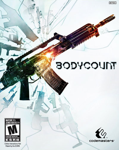
Bodycount
I have no comment on the quality of this game, because I’ll likely never ever play it. But this cover art is simple, and pretty. I don’t mind the use of neon rainbow colors, sitting against the stark white they stand out quite beautifully. If only the game itself showed as much restraint and ambition.
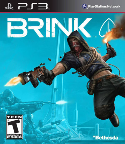
Brink
For a game that’s all about running and shooting, you wouldn’t expect something so restrained. The bright turquoise and the full color rebel fighter went go to great lengths to sell an aesthetic, that was arguably lacking in the game itself.
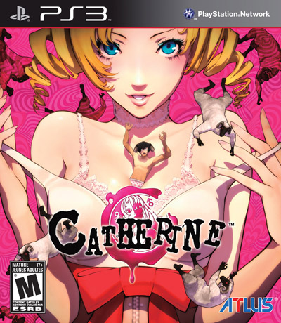
Catherine
This is one of the weirdest things I’ve ever seen. For that reason alone, I included it on this list. Another, and more important reason, is this: go to your local game store and look at the display of new games. How many of them have pink on their cover, let alone are predominantly pink? Atlus knows how to sell its niche products.
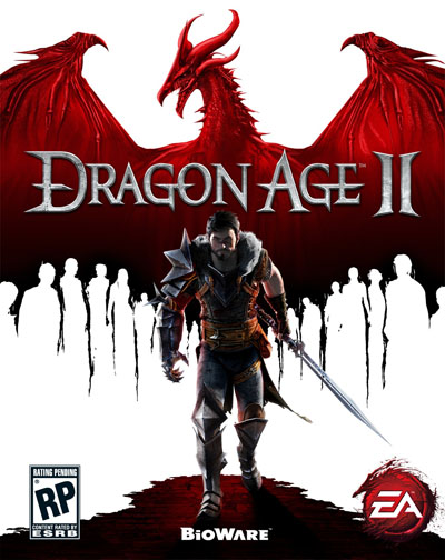
Dragon Age 2
There a tendency among marketing folks to oversell a game by putting everything they can on their box art. This is a great example of how effective minimalism can be. I’ll give a million extra points even because I didn’t notice the silhouettes of people in the Dragon wings until this week, despite the game coming out 9 months ago.
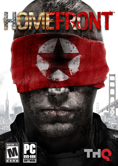
Homefront
The best thing you can do with box art or any marketing materials is create a simple, iconic image. An image so powerful that you can’t help but think of your product when you see it. Homefront does this. It would be nice if the game itself were half as effective and bold as this cover.
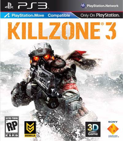
Killzone 3
The bright orange title mirrors the glowing eyes of the Helghan soldier, a character that I’ve always loved the look of. While there was a major shift towards primarily white backgrounds in a lot of box art this year, this game was one of the first and most effective. Its worth noting that I still like this cover, despite all the extra cover information that Sony forced upon.
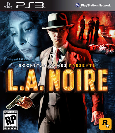
LA Noire
Rockstar knows cover art. I can imagine this cover sitting on the shelf next to classics like The Maltese Falcon or The Third Man with out anyone batting an eye. Its the perfect way to acknowledge your influences, something that Rockstar is particularly adept at, while still keeping in line with or perhaps leading box art trends.
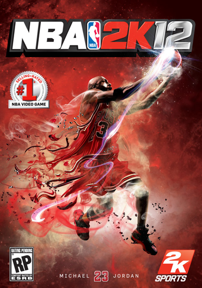
NBA 2K12
I don’t envy the sports game cover designers that have to keep cranking boxes with dudes in jerseys on them year after year. While EA founds its niche with scribbles and paint splatters, this 2K took it one step further. I can almost imagine Michael Jordan grabbing a rebound and BAMFing Nightcrawler-style all the way to the other side of the court to score.
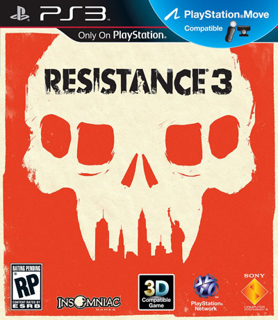
Resistance 3
2011 was a banner year for box art. If only for the fact that Sony and Insomniac went out of their way to do something different with their Resistance 3 box art by hiring the incredibly talented Olly Moss. Its like one of those fake Criterion Covers come to life. Not only does it sell the game in appealing way aesthetically, it actually fits quite well with the tone and setting of the game.
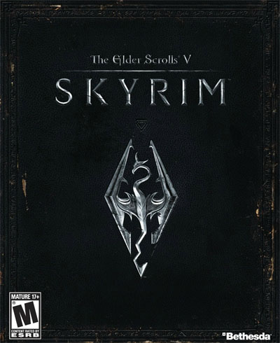
Elder Scrolls V: Skyrim
Is there a more appropriate cover than a simulated leather-bound book for a game thats all about telling your own story? I think not.

No Comments