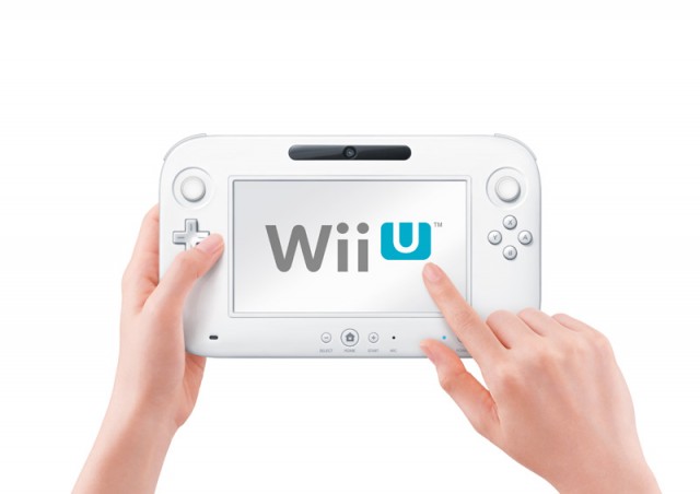
We wrote earlier today about our thoughts on how the Nintendo Wii U could represent a fundamental shift in home console gaming, but how did we feel about the actual Wii U as a device?
We spent a good chunk of time with it at E3 last week, riding a bit of a high from the sizzle reel at the press conference. It was a similar situation to what went down with Nintendo at 2010’s E3 press conference, when the 3DS was revealed and everyone rushed to the Nintendo booth afterwards.
Similar, but a little different, especially in what was delivered.
What Does It Do?
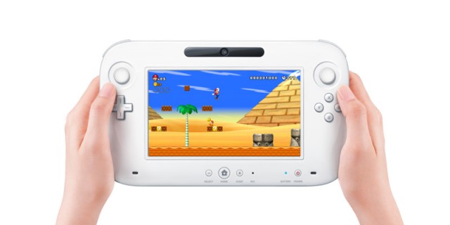
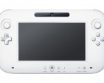
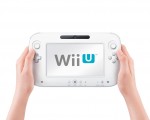
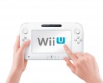
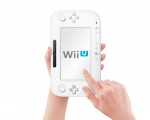
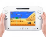
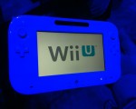
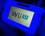
The Nintendo Wii U is the successor to the mega popular Nintendo Wii. This time, the new HD console comes packed with a 6.2″ touch screen controller with built-in microphone, stereo speakers, front-facing camera, accelerometer, gyroscope, rechargeable battery, dual analog sliders, and two sets of L & R shoulder/trigger buttons. There are ports everywhere on the controller, which many are dubbing the WiiPad, and it works wirelessly with the Wii U.
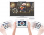
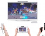
The console is capable of full 1080p HD, and is supposedly more powerful than the PS3 and Xbox 360. It can stream video to the controller, either creating a dual-screen experience or replacing the TV altogether. Video feeds can even be switched on the fly between the two, depending on what you want to see up close and what in larger scale.
The Controller
If you’re not holding the controller, it looks massive. However, once I got my mitts on it I realized that not only was it very light (about as much as an Xbox 360 gamepad) but is also fairly comfortable. My fingers fell on the triggers and shoulder buttons perfectly, and aligned to the analog nubs and buttons easily without obscuring the screen. The sliding nubs are similar to the ones on the Nintendo 3DS, except stand a little taller. They felt fine, may take some getting used to when playing FPS games where rocking an analog stick is the norm. The overall controller felt slightly wide and will take some getting used to, like a big Wavebird. It’s not an iPad, but I don’t think I’d want one here (yet).
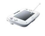
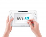
We didn’t get to use the camera or sensor bar that are built-in to the pad, but the stylus that comes as a part of it is eerily similar to the DSi’s plastic stick as opposed to the 3DS’s refined chrome one. Even though the touch screen is resistive, it’s highly-responsive. Not once did I notice (or care) that it did not incorporate multi-touch. It’s bright, vibrant and gorgeous, and seeing the image streamed to it didn’t seem to lose any visual fidelity.
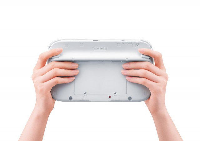
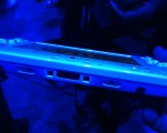
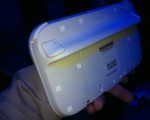
The build of the controller is solid and won’t break, but the design could use some work. The form language is comfortable, and the soft textures feel great and non-slip. The big issue I had was with the extreme variety of buttons, holes, screws, exposed ports and wires, and manufacturing sinks that are designed into it. The back side is pretty ugly, and it kind of cheapens it.
The Console
Nintendo went into minimum talk about the console’s specs. From what we’ve heard from developers, it’s at least as powerful as the Playstation 3. IBM is supplying the CPU, which is rumored to be the same as the one that powered the Jeopardy-beating Watson, and ATI’s R770-powered last-generation Radeon (about 1-2 years old) is the visual horse. How that equates to actual power we don’t know, but considering that the Xbox 360 and PS3 chipsets are now going on 7-yrs old we have a fair assessment that it will probably top those two. Again, pure conjecture until we actually see some games that are designed for the device as opposed to a highlight reel of Xbox, PS3, and PC video.
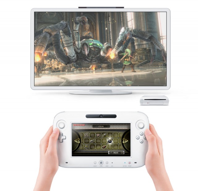
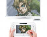
The demos that Nintendo had on the show floor were extremely basic in visuals. Yes, they made Mario and Miis look terrific, but those don’t demand high levels of detail, either. The Zelda HD demo, as you might have read, wowed everyone who saw it. It was stunningly gorgeous, and if it’s any indication of the visual fidelity that the console can produce then color us all pleased.
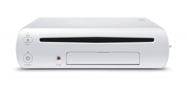
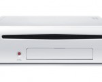
The actual console design looks like a simplified Wii, if that could even be a possibility. Nintendo has removed the chiseled edges and replaced them with soft, friendly curves. It now has a bright red visible “sync” button on the front, which takes away from the console’s soft white color. Because it’s curved, the door on the front that hides the two extra USB ports and SD card slot looks like out of place. Gone are also the Gamecube controller ports, and Nintendo has noted that the console will only be backwards compatible to the Wii and not the Cube. That’s fine; it’s not going to be a missed feature to any but the most nostalgic of fans.
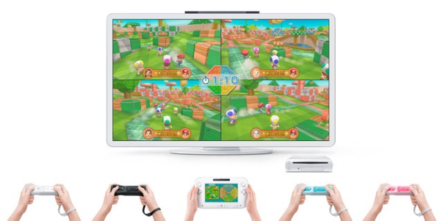
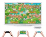
Unknown is if the console will support more than one of the tablet controllers. Nintendo has dropped hints that it may not, but the R770 chips are capable of supporting 4 or more video streams at once. More information will come later, the company says.
How Did it Work?
The tech demos that Nintendo had on the show floor were all rough concepts. I’m confident that a few, like Chase Mii and Battle Mii, may appear as a part of an included compilation disc much like WiiSports did with the original Wii, because of just how fun and addictive they were. The technology worked great. It was incredibly quick in switching between the screens, and showed absolutely no noticeable lag. The screen was highly responsive to touch mechanics, and I never felt like I was burdened by the older screen technology. The weight of the controller never wore down my hands, either.
It was just as Nintendo had sold us: excellent streaming technology that made playing the games more enjoyable and unique. It works extremely well.
But…
But there was a hitch. The demos were all rough cuts of relatively casual games, save for the Zelda HD and Ghost Recon Online stations. I know that the HD visuals weren’t necessarily the big push for the device, but it would have been great to see Nintendo actually showcase something more than Miis running in blocky arenas. I actually felt a little underwhelmed by the end of my time with the device. Nothing was there to instantly blow my mind, or tell me that Nintendo can compete with Microsoft and Sony on a core game level.
To top it off, Nintendo did a poor job of showcasing the controller during multiplayer games on the show floor, sticking the other 3 players with WiiMotes. The standard practice for each station was to rotate the controllers, so that if a player (who had been waiting 5+ hours) just joined then it would be at least 3 matches before they would get their hands on it, and even then only for a couple minutes before needing to give it up.
Nintendo has also been coy on release date and price, only stating “2012” as a time frame, and that the device would be comparative to the technology. Nintendo doesn’t take losses on their hardware, so somewhere around $300 – $400 sounds likely. No online structure was even hinted at, either. The entire reveal of the device seemed rushed, probably due to the overflow of information that came from developers beforehand. It was somewhat disappointing.
It’s All Bout Innovation
As underwhelming of a showing as Nintendo had with the device, I can’t help but wonder about the possibilities. What kinds of games will come from experienced and creative developers like Ken Levine, Hideo Kojima, and Shigeru Miyamoto? The comparisons to the device as a giant DS may seem like jest at first, but multiple-screen home gaming is the future. As someone a part of the majority who shares one big-screen television as their major entertainment center, being able to continue playing a game while my wife watches HGN (or my daughter watches Mickey Mouse Club House) is going to be a blessing. Whether it’s as simple as a map, or as complex as aiming a perfect pitch in MLB 2K or a sniper zoom in Call of Duty, the creativity can really change how games are played.
Nintendo is at the forefront, again. I just wish that they’d showed more of it at E3.




No Comments