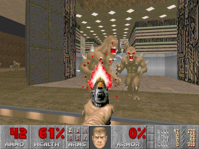
I’m a big fan of user interface — well, I should clarify: GOOD user interface. I think my iPhone is hot, Windows 7 is sexy, and of Natal as the future of interaction. I love looking at visuals and how I interact with them, in what is known as HMI (Human-Machine Interface). As gamers, we’re most familiar with on-screen HUDs as our preferred user interface.
While playing with iTunes’ Cover Flow recently I came to the sudden realization that first-person view, something that gamers have been accustomed to for almost 20 years, has broken into the mainstream graphic design and HMI world.

Granted, this is not necessarily new for the HMI industry but thanks to technological advancements it is ever more prevalent.
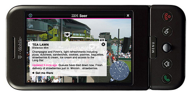
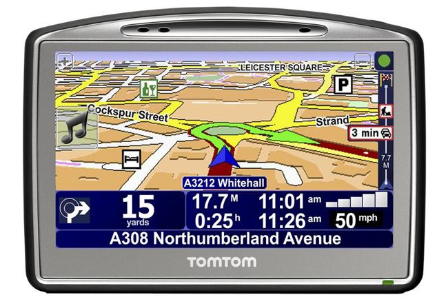
Look at navigation systems like TomTom, map systems like Google Earth, and even augmented reality iPhone apps: the view on the screen or through the camera is in three dimensions. It has depth, perspective, and thickness, and allows the user to have information available as needed: whether it pops up on the screen as the user approaches a destination, or it grows and shrinks away based on need, as if you were driving towards it (or walking towards a Wolfenstein Nazi).

Things we have become accustomed to — floating arrows telling us where to go in Mario Kart, or even on-screen mini-maps in Halo — are now found in Google Street View and IBM’s Seer, pointing us to specific landmarks.
The FPS is everywhere. Is it because the current techy generation has grown up playing games from that viewpoint, especially with the popularity of FPS games over the last 5 years? Is it just a natural progression of graphic design to make things more interactive and “realistic”? The most commonly understood reason is that the viewpoint reflects familiarity; by mimicking what we see in “real life” our digital experience is much easier to understand.

Regardless of what the reason behind this use of the graphical view in modern HMI is, the technology behind it in videogames will keep users aware of and accepting of it as gaming tech progresses.
Have you come across any interesting uses of FPS view in modern user interface? And for you graphic design buffs out there, have a look at Smashing’s take on improving HMI through the use of the FPS view.

2 Comments