Just like any other product, video game consoles go through several industrial design iterations before they actually make it to launch. From controller designs to cartridge locations, the evolution goes through some great iterations, eventually landing on what we know as the iconic version of a Genesis or SNES.
We’ve compiled a bunch of images showing these design evolutions that we think you’ll enjoy, so venture with us to examine what could have been, what did happen, and what we (thankfully) missed.
The Super Nintendo Entertainment System
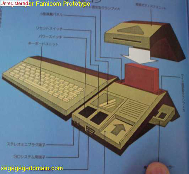
The SNES began life as the Super Famicom in Japan. Some of the first few designs extended the “family computer” nature of the previous console, including a keyboard attachment, card reader, and some sort of separate cover:

Image courtesy Nintendo, via SegaGaGaDomain
Thankfully, the design became much more condensed, removing the accessories for the more appealing, streamlined direction that we know about:

Original prototype image courtesy Nintendo Power (Sept 1990), via SNESCentral
Nintendo chose to drop the single-color red buttons for a more monochromatic look, going gray for the box with only the logo being in color. The controller face buttons were color-matched to the logo.

Final Japanese Super Famicom
For the European PAL regions, Nintendo simply changed the name to the “Super Nintendo”:

PAL SNES
When it came time to develop the US version of the Super Nintendo, Nintendo decided that a new design needed to be made. They turned to Industrial Designer Lance Barr to come up with some concepts, which included thin cards, “crank” load and release methods, and wild shapes. Elements of his design concepts eventually made it into the NES2 later on:

Image courtesy Nintendo Power Vol 25, via SNES Central
The final US design is the one we all remember as being boxy and purple, adding a concavity in the top two face buttons to differentiate them from the others:

Final US Super NES
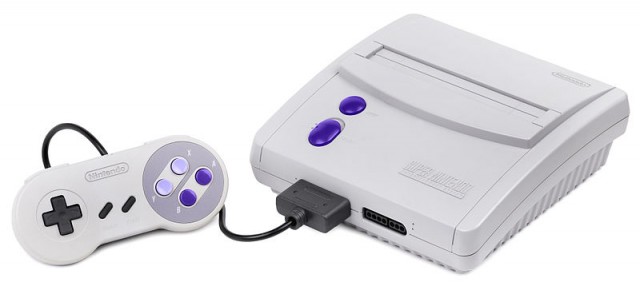
As the SNES aged, so did its design. Towards the end of its shelf life, the Super Nintendo was redesigned to be more compact and post-modern:

Other designs included the now failed Super NES CD (which later became the basis for the Sony Playstation):

Image courtesy Wikia
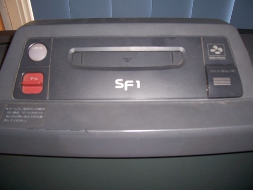
… and the SF1, which was a Sharp-design television set with a built-in Super Famicom:

Image courtesy Wikia
Information via Wikipedia, Wikia, SNES Central, Nintendo Power


2 Comments