The Playstation 3 is currently selling less than the Wii or XBox 360, the other modern generation gaming consoles on the market. Not only is it selling less, but it is selling far less. The reasons for this are plentiful, minimal, maximum. In fact, each person has their own opinion about why the system has fallen drastically behind the sales pace of its forefathers, the PS2 & PSOne, and cannot even catch up to its sibling, the PSP.
In 2006, the machine was hyped beyond belief. It was featured everywhere, starring in millions of dollars’ worth of advertising campaigns. So what went wrong?
In this article, the first of a series, we’ll examine what it could take to change the fortune of the PS3. From our perspective — consumers, fans, gamers — the system has potential, but is being held back by a few major issues & design flaws.
The Machine
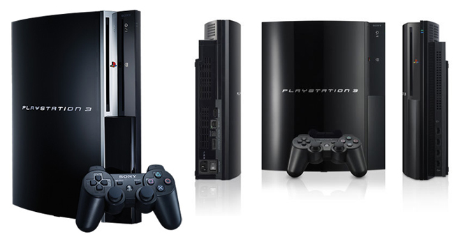
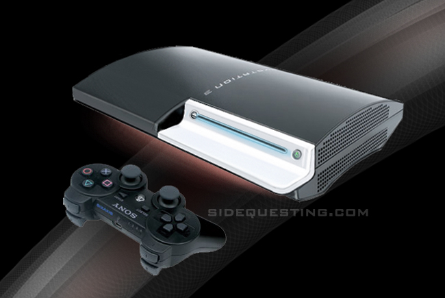
As a product designer I’ve been taught about human interface, aesthetics, and innovation. I know that the first thing you notice about a product is the way it looks and feels. When I first saw the PS3, I felt as if all of the basics were there for a truly great and iconic design. The theme: an airplane wing meant to signify elegance, technology, and “newness”. The result: a large, heavy piece of plastic with badly-designed user interfaces. The PS3 is designed to be the monolithic hub of home entertainment designed to tower above the competition. The girth of the system however makes it difficult for a twelve-yr old to pick up and shift to a new location in the house when the parents want to watch “Dancing With The Stars”. Reducing the size of the PS3 would be ideal. The recent rumor of a slim PS3 showcases what appears to be a new PS3 model (or quite possibly an elaborate fake). This model is still too wide and deep.
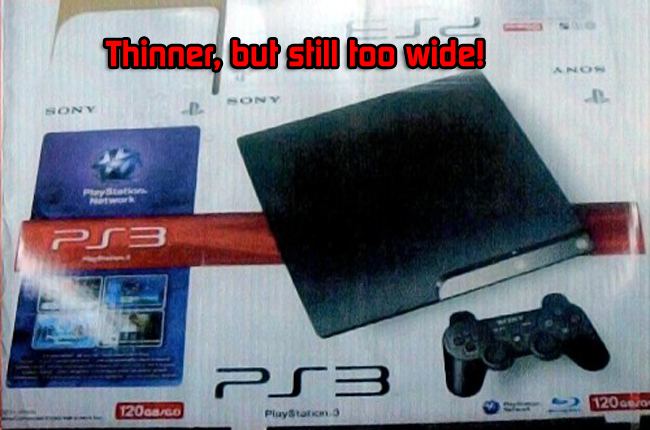
What really needs to take place is a thinner AND narrower PS3 redesign.
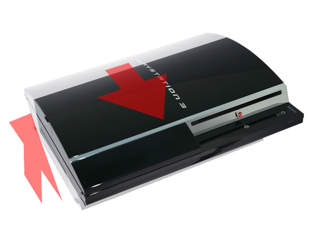
Besides this, there are a few interface issues that need addressing. The power & eject buttons are touch sensitive. While a cool technology, consumers (especially children) like the tactile feel of pushing a button and hearing it click. Redesigning these buttons (and placing the eject button next to the disc drive) would be optimal. As an addition, the PS3 could include the growing trend of lighting in consumer electronics. The blue Wii disc drive light is iconic, for instance. The PS3 could capitalize on this trend and add ambient lighting (such as that seen in some Philips televisions of the last few years). A glowing, shifting light cascading down under the PS3 would not only give it a nice feature but would also allow the PS3 to appear as if it was floating.
The Guts
Sony has the highest-selling console of all time: The PS2. So, with backwards compatibility such a focus on other consoles why did Sony decide to remove it from the PS3? Cost-saving was one excuse, spurring the sale of the PS2 and PS3 as separate products was another. But in reality, a PS3 with PS2 compatibility would strengthen sales of the PS3 and continue to spur PS2 software sales. Also a bone of contention is the constant addition of SKUs with changing content. 40GB HDDs, 80GB HDDs, 120GB HDDs — all continue to confuse consumers as to which PS3 is the right purchase for them. Sticking to one HDD SKU (40GB) with the sale of separate Sony-branded hard drive upgrades would be a better opportunity.
The User Interface
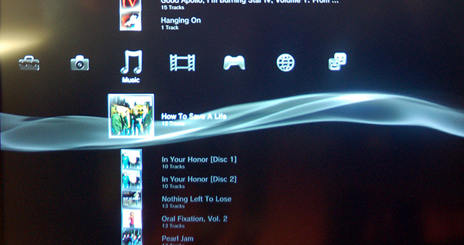
The biggest issue I have with the PS3 is the confusing user interface. Once booted up, the system can be nearly impossible and intimidating to navigate to what I need to get to. By trying to be all things to all consumers, Sony has turned the PS3 into a glorified PC. My wife needs to call me every time she wants to watch a Blu Ray or browse photos, since each part of the XMB (cross media bar) is a confusing mess.
Sony needs to focus on selling a games machine first, not an all-media browser. The Wii’s interface, although having its own issues, is much easier for the average non-gamer to navigate. The 360 has made great improvements as well. The PS3 needs to have a friendlier, simpler interface. Focus on the three tiers of what makes the PS3 great: blu ray, games, and connectivity. Therefore, these should be the only parts of the XMB that should be initially available.
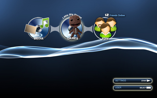
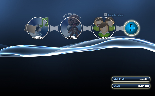
Placing the three icons — “Media”, “Game”, and “PSN” — on the screen, along with quick one-button access to Global and User Settings, allows for intuitive access and navigation. These icons would show the current game disc in the machine, the blu ray or downloaded video ready to play, and how many friends are online. By navigating to the desired icon the XMB will expand to feature the tier’s items, and a simple single click while on the initial icon would launch the game, movie, or PSN without needing to navigate down to it.
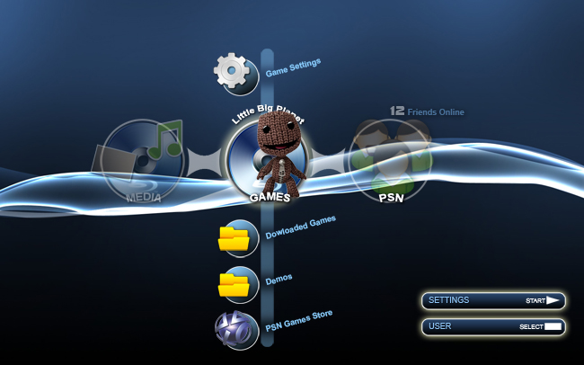
The XMB could also incorporate the ability to customize & add to it. By clicking the “+” icon a quick link to a specified item on the PS3 can be created, allowing the user to customize the features he or she uses most on the machine.
The Business
The final point of the PS3 redesign is the most obvious: price. Bringing the PS3 in line with the 360 ($299), while selling separate Sony-branded HDDs at a profit (like Microsoft does with the 360’s HDDs) would allow Sony sales to pick up. Although the system would still be sold at a loss (of about $140) it would at least be able to compete with the Wii and XBox 360 in price. In fact, a price drop now would make for an impulse buy over the Wii. Another avenue to take would be to include vouchers in Sony’s televisions, in Blu Ray discs, in its cameras, and in the box with the PSP for further discounts on the PS3 ($25-$100) to help spur sales. The big factor for profits isn’t the PS3, but the software. By spurring sales of the PS3 (and including several demos of games on the system’s hard drive) software sales would follow. And by “pulling a Microsoft” and buying rights to timed exclusives for the system the company could nail some key games that would push software even more. The PS3 also needs a huge re-branding. Focusing on the three tiers in separate campaigns could be a way to do this, hiring different ad agencies to cater to the different portions.
In Conclusion…
As we know, throwing money at the business end of the product is something that Sony… well, Sony ain’t got the money. At all. Instead of a massive price cut (which we would all want) the voucher route might be an interesting way to go, and the branding aspect is immensely important. The user interface needs a definite improvement, with more of an “Apple”-like approach to connecting to users. The product’s aesthetic redesign, although a “nice-to-have”, is on the low end of the importance scale.
Will Sony take the initiative on any of these concerns? The answer is probably “Yes.” Sony knows that the PS3 could go into life support in the US if it doesn’t do something drastic to improve its viability immediately. What those changes could be, we’ll have to wait until E3 2009 to find out.
How do you feel about a PS3 redesign? Do you think it’s necessary? What would you change?
[All images courtesy Sony; All redesign images courtesy… us. :) ]


14 Comments